New York University
Improved NYU’s maintenance turnaround time by 30 for 50,000 users by redesign the system and integrate machine learning micro-services.
Collaborated with James Walsh (Project Manager), Brent Maddox (Product Owner), Meenakshi Baker (Group Product Owner), Adanna Omatu (Full-stack Engineer), Michael Mechman (Full-stack Engineer)
Background
Challenge: Legacy software compounded labor
We found staff tracked each request in a different place. They used legacy software and copied details to Google sheets. In addition, no one could find the latest update easily. Every switch between tools cost time and focus.
Solution
We replaced NYU’s patchwork of tools with a single system. Staff tracked requests in one place. They saved time and shared updates faster.
Impact
Turnaround time dropped by a third
Staff cut time spent on follow-ups in half
Teams could finally focus on keeping NYU running, not tracking work requests
Shadow research and focus group
We shadowed staff and ran focus groups. We watched how staff handled requests and how permissions shaped their work. We surveyed people who sent requests and talked to maintenance crews. This showed us the whole system, from request, manage, to repair.
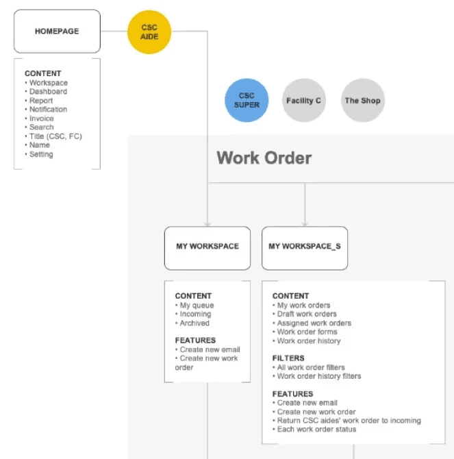
Permission management
Mapped user types, permissions, and workflows. This clarified scope and sparked crucial cross-department alignment.
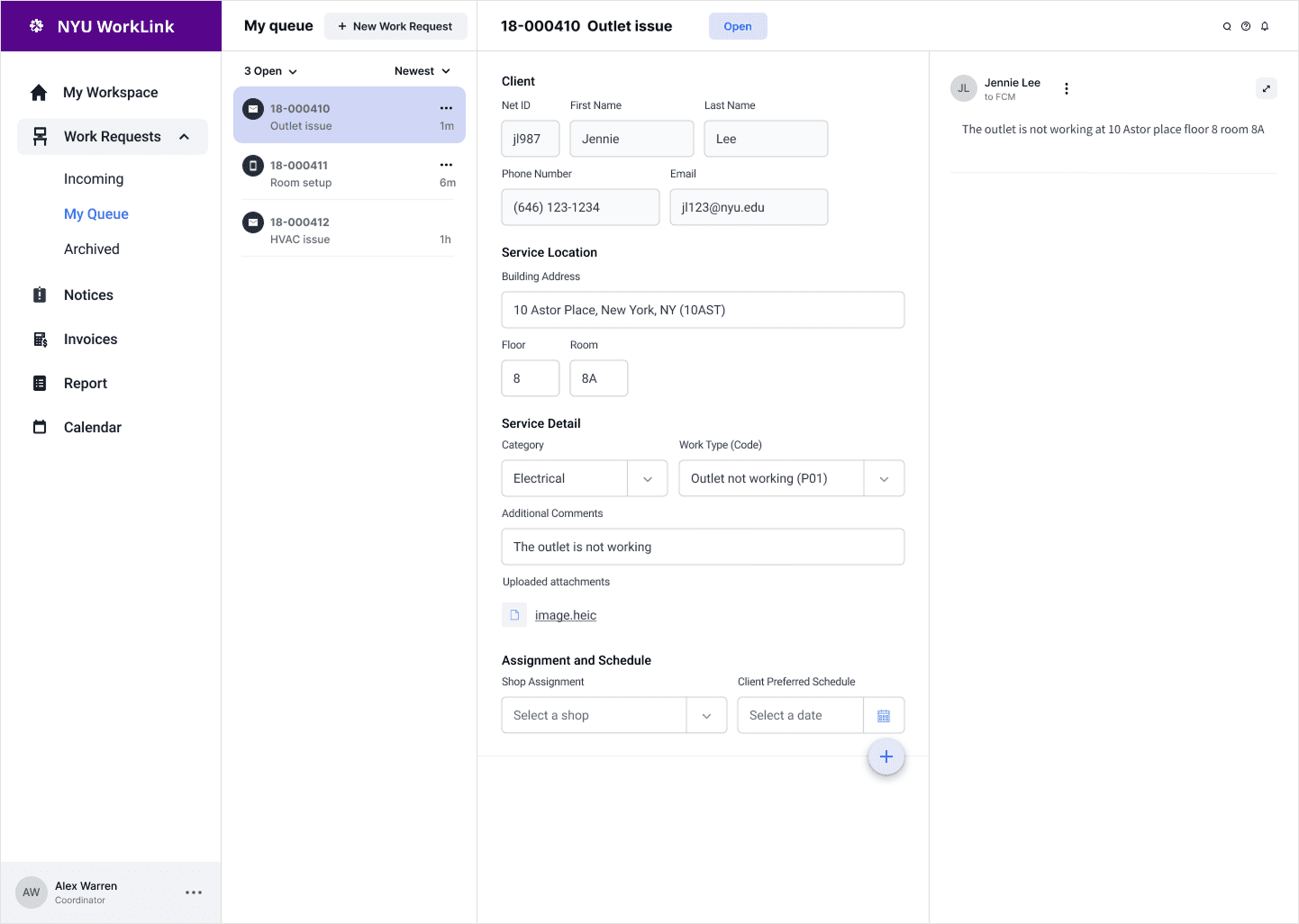
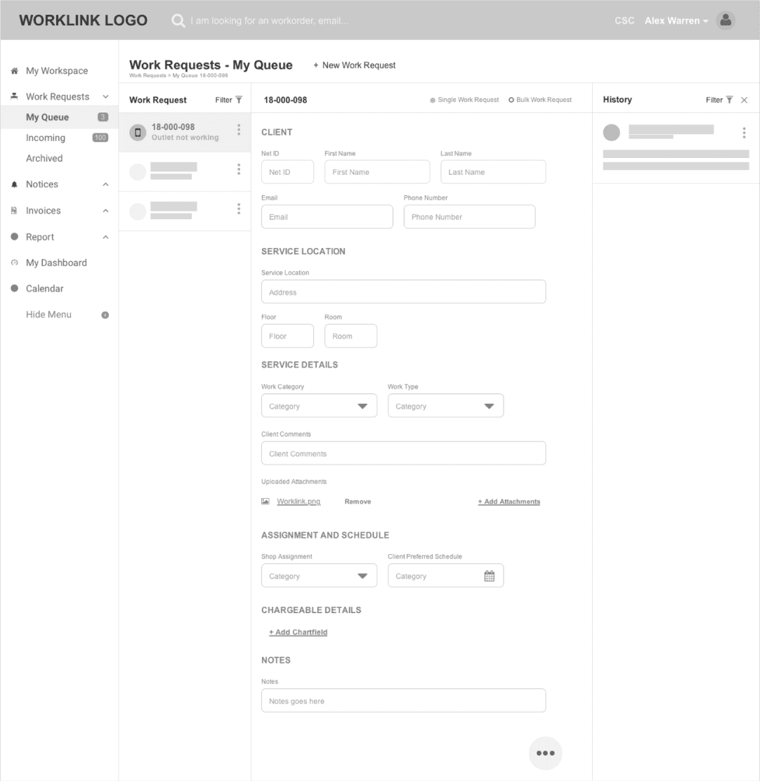
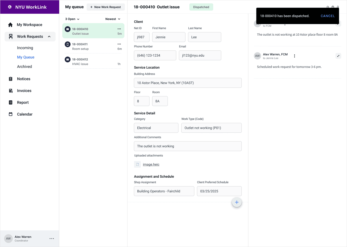
A/B Testing and Usability benchmark - Form design
In the dashboard, one of the main focus was form design. We tested two form layouts in the dashboard. The paginated view cut distractions and kept users focused on each step. The single-page view made scanning and editing faster and more predictable.
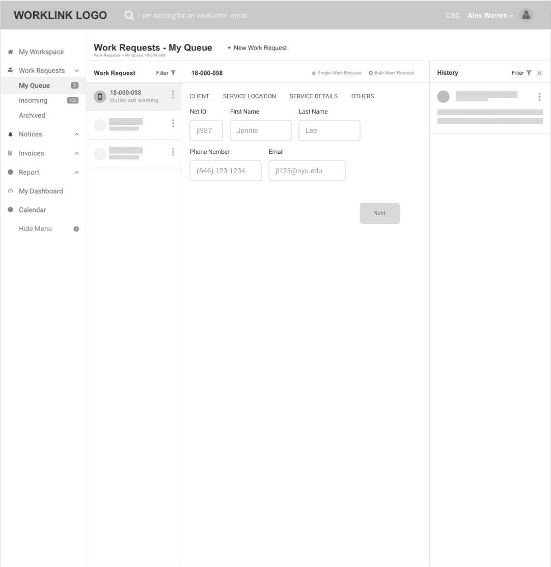
🔴 Paginated form view
✅ Helps new users focus on one task at a time
⚠️ Makes back-and-forth edits more cumbersome
Prototype
Defining design system
We built NYU’s design system from the ground up. I worked with brand design to match guidelines and meet accessibility rules. We created components that kept every product consistent.

Color palette
We built a color scale around NYU’s purple. Every shade met brand guidelines and passed contrast checks for legibility.
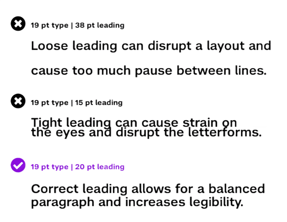
Line spacing (leading)
We set line spacing guidelines so future designers know the logic behind each choice. This keeps text readable across product suites.
Retrospective
Gave feedback early and often and tailored design deliverables for each stakeholder.